Sunday, May 20, 2012
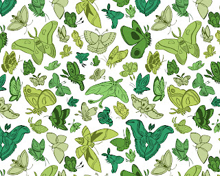
Moth Pattern.
Here's one of the final things I'm going to post from my last semester at MICA- a pattern of moths I made for my thesis! I have always loved insects, and moths are no exception- I just adore how fuzzy and cute they are. I ended up printing the first pattern out on fabric through Spoonflower and made a pillow for my thesis show, just as I had done with this pattern!
Labels:
Bugs,
Insects,
Moths,
Pattern,
Spoonflower,
Surface Design
Saturday, May 19, 2012
Horse Pattern.
Surprise, surprise- I made a horse pattern in thesis! I decided since today was the running of the 137th Preakness Stakes horse race that it was an apt time to post it! Each horse is accurately colored to an existing type of coat seen in the equine species! It was a lot of fun to do this pattern, though initially it was far more limited in it's scale- Initially I had only a few different colors, but a friend suggested doubling the pattern and pushing myself with it to really make it a unique surface design.
Labels:
Equine,
Horse,
Pattern,
Surface Design,
Thesis
Thursday, May 17, 2012
London 2012 Olympics Aquatics Poster.
So this is the last poster I made for the London 2012 Olympics in my Independent Study, this time it's representing the Aquatics division of the games! Swimming competitively was a big part of my life from age 7 to 18, but after graduating from High School (and after serving 4 years on my school's varsity swim team) I knew I wasn't fast enough to have it really take me anywhere farther. Although I don't compete in swimming events anymore the sport is near and dear to my heart, so I was quite jazzed to work on this piece. The background features the London Eye, and the pattern used in this piece was based off of one found on this vintage English teapot.
Crystal Pattern.
Here's another pattern set I made in thesis- crystals! I've always been fascinated with crystals (and rocks, oddly enough) since I was a kid, so I figured why not make a fun design with them! Experimenting with geometric shapes was quite a change of pace for me, but I had a really good time with it- might have to start incorporating them more in my work!
Tuesday, May 15, 2012
London 2012 Olympics Athletics Poster.
This is another poster from my Independent Study with Daniel Krall! This time it's representing the Athletics division of the Olympics. Our runner is sprinting past Saint Paul's Cathedral (which is toting a pattern I based off of this antique English chair). I had a lot of fun with this, but for me the most difficult part was the scale of the figure- most of my sketches tried to include the entirety of his body, but it wasn't really giving me the aesthetic/the composition I wanted/that looked best.
Feather Pattern.
Sorry once again for the delay in posting my work from the semester, but a bunch of stuff happened all at once and I was quite preoccupied- I finished all of my classes at MICA, put up my senior exhibition (expect photographs soon), and graduated! Crazy, I know. I still can't get over the fact that I'm no longer a MICA student- 4 years went by so fast!
After doing editorial work for the first half of the Spring semester I wanted to make some patterns for surface designs- these are a pair of feather patterns I made! I had a lot of fun with them, and figuring out my color combination choices was really entertaining. I ended up printing the first pattern out on fabric through Spoonflower and made a pillow for my thesis show- don't worry, I'll be posting photos!
Saturday, May 5, 2012
London 2012 Olympics Equestrian Poster.
Another poster for the London 2012 Olympics, this time representing the Equestrian disciplines featured in the Olympic Games. I incorporated a pattern referenced from this antique English chair in my hand lettering, and the horse is jumping the famous Tower Bridge! In this poster the hardest part was figuring out a way to balance what details of the architecture to include and what to ignore but I think I found a successful way to go about it! I am a competitive horseback rider so doing this poster was nothing short of an absolute pleasure- when I have the opportunity to draw horses/riders, I take it!
Labels:
2012 Olympics,
Dan Krall,
Dressage,
England,
Equestrian,
Equine,
Eventing,
Fabric,
Horse,
Horse Show,
Independent Study,
London,
London 2012,
Olympics,
Pattern,
Poster,
Show Jumping,
Summer Olympics,
Tower Bridge
Thursday, May 3, 2012
See No Evil.
Another thesis piece as we draw to the end of the year/the commencement show! This was actually one of two editorials I did based on the This American Life episode See No Evil. I wasn't as satisfied with the second piece however, so I scrapped it. The story focused on people ignoring the very negative things going on in their life to their detriment. For this piece I played around a lot with the concept of willful ignorance and threw in a reference to wearing "rose colored glasses". On the whole, I am pretty happy with how it came out!
Labels:
Editorial,
NPR,
See No Evil,
Thesis
Subscribe to:
Comments (Atom)


